15 October
2023
A new map quiz
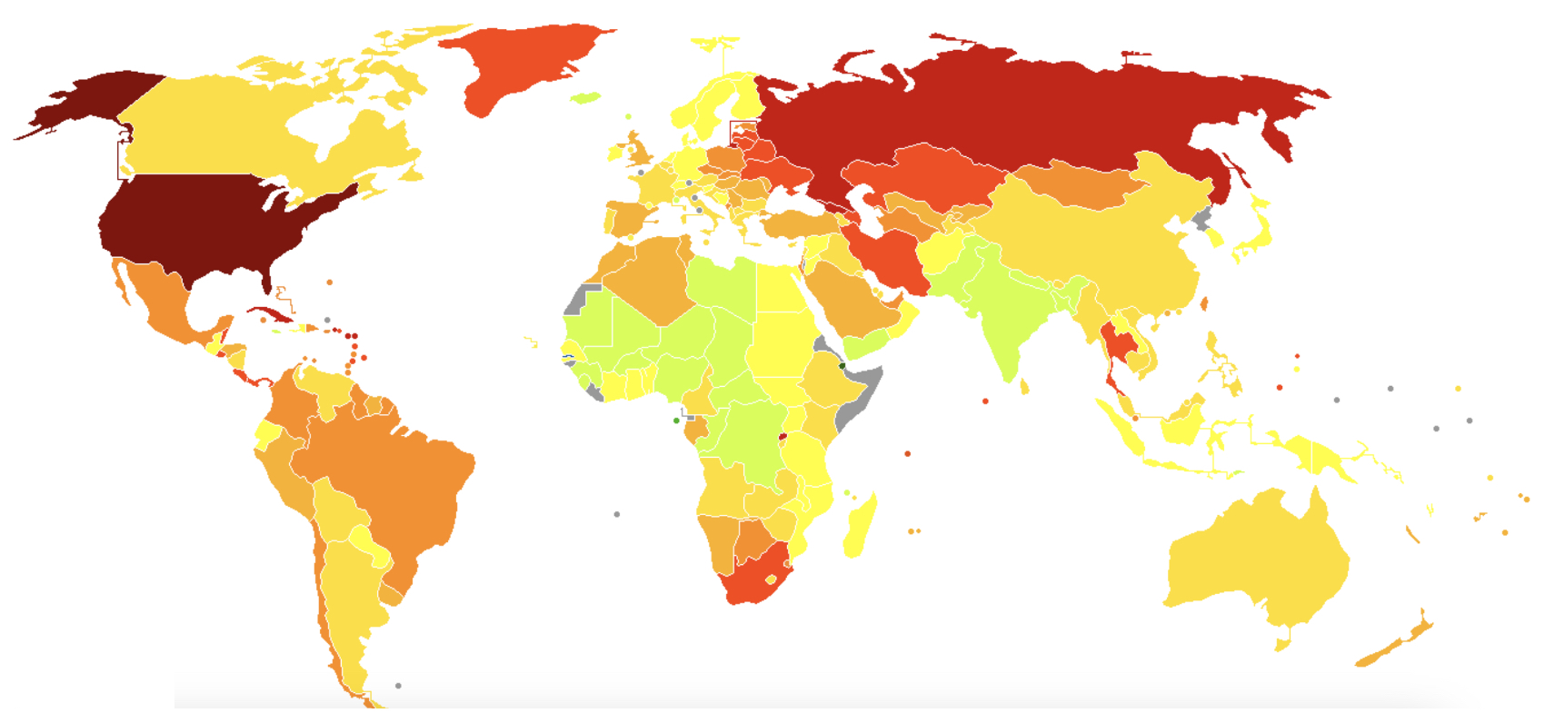
What do you think this map is all about? Here are some hints:
1. It is related to population
2. Darker colors mean more
3. More is not good

What do you think this map is all about? Here are some hints:
1. It is related to population
2. Darker colors mean more
3. More is not good

As Christine Thrussell figured out (and soon after so did Vijay Ramchandran), this is a map of incarceration rate (how many people in prison on a per capita basis).