7 October
2023
Map quiz for all of you
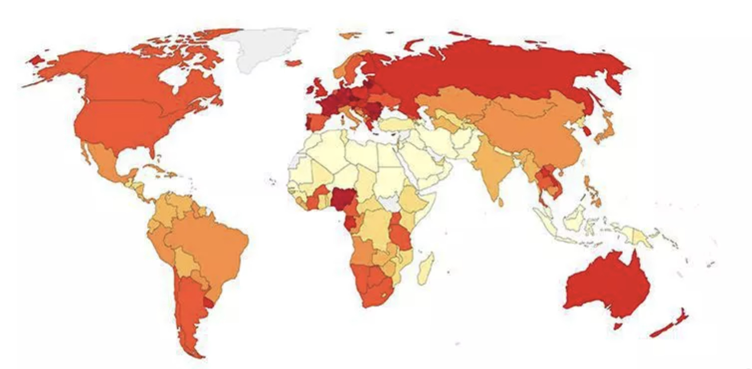
Look at the map below. What do you think this might represent? Of course, darker color represents more and lighter colors represent less. Write your answers in the comment section. Would be interesting to see what kind of patterns you detect too.
Want to try?

As Vijay Ramchandran figured it out, this is the map of per capita alcohol consumption in the world by the various countries!