15 July
2022
How do you explain this?
This morning, around quarter to ten, I was doing a quick check of the stock market when something caught my eye.
Note that the Dow graph shows that it has been going down since market opened. And yet, inexplicably, it was green in color. (should have been red). Even better, you can see that just above the graph, it shows that Dow has been up by over 300 points at that point of time.
I guess I should not complain as long as the market is doing well. But still, I can’t explain this.
Can you?
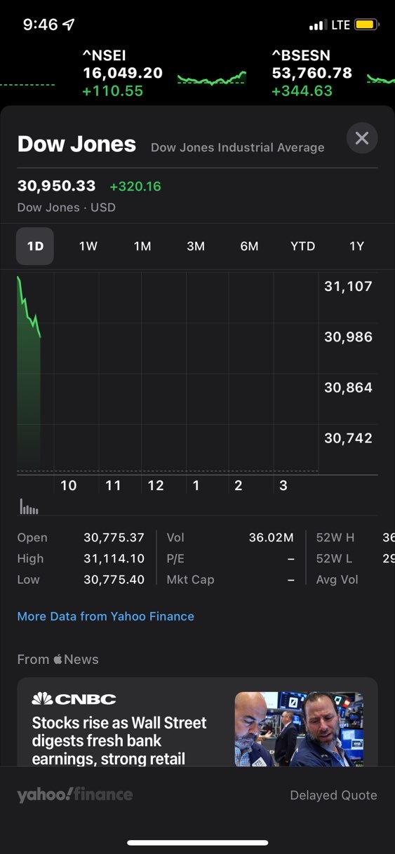
The change figure (which decides the colour) is from previous day close. So, although the index may have fallen through the day, but it’s still 320 points above previous day close.
I did not realize that is how it works….